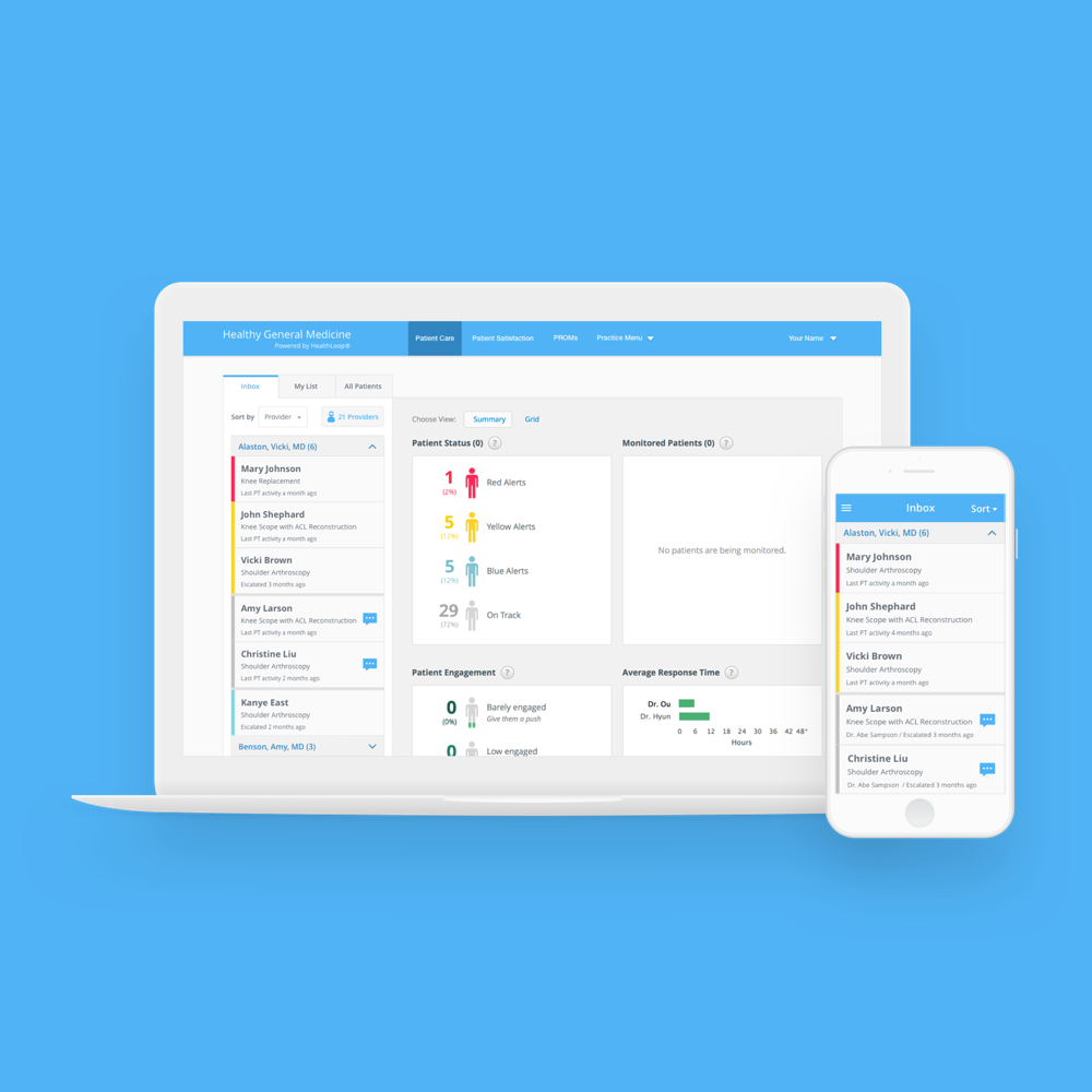
Staff Inbox Redesign
Optimize the process for clinical staff to clean up inbox
Optimize the process for clinical staff to clean up inbox
About Healthloop
Healthloop is an automated patient engagement solution for hospitals and clinics. It helps doctors better take care of surgery patients by providing digital followup through daily check-ins questions and delivering empathy and responsive communication.
This project was to focus on dealing with the product legacy, a common challenge in enterprise software design. The problem is that clinical staff users are overlooked with information with applying the filter, which compounded by a workflow issue. The solution to this problem lies in combining two new models: a new sorting mechanism and navigation improvement for better findability. This design effort also included DLS (Design Language System) revamp to match updated style that started from our standalone activation app.
Design Lead
Stakeholder Interview, Information Architecture, Task Flow, Wireframe, Prototype, User Testing
4 months
As the only designer of this project, I’m responsible for the UI redesign, UX enhancement, and usability testing. I worked with a cross-functional team, including product manager, customer support, and engineers. Contribution included wireframes, task flows, user testing reports, and the final visual design based on internal critiques and user studies.

As clinical staff, they work with multiple doctors and interact with their patients regarding symptoms, comments, and questions through the application. Throughout the design process, I used the pre-existing persona to guide decisions about features, navigation, and interaction.
Helping clinics to improve care coordination with patients was where the business started. Back in the days, the application mainly focused on small orthopedic practices that had low volume of patients and surgeries per day and one or two surgeons at a facility.
However, HealthLoop has changed so much and shifted business focus to large healthcare enterprise solutions, which means the current design no longer meets the needs of our business. And this rapid business model change introduced great challenges on the product design.
How might we improve the clinical staff users’ work efficiency and fix usability issues to improve NPS while adapting the existing product and minimizing the changes?
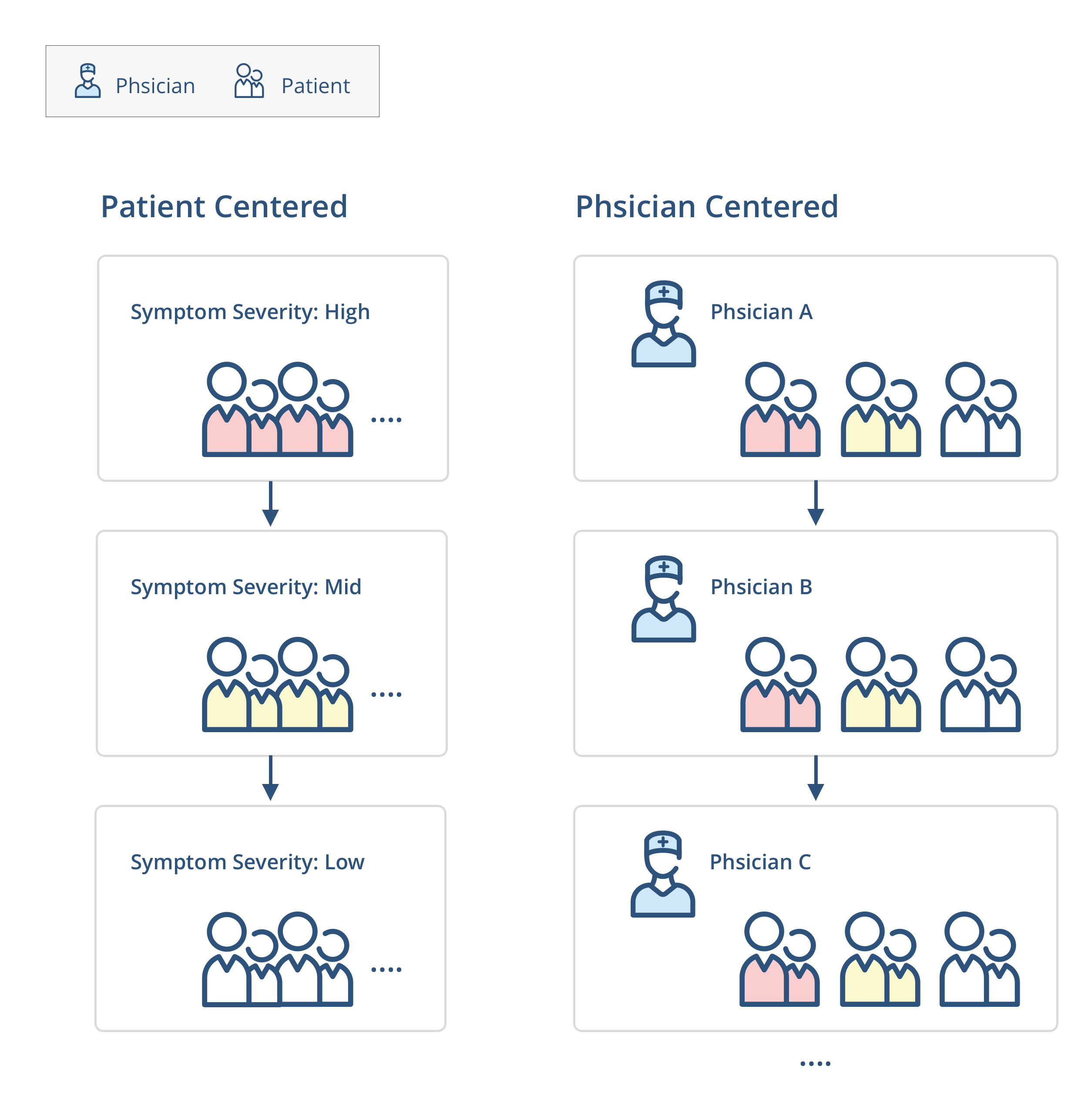
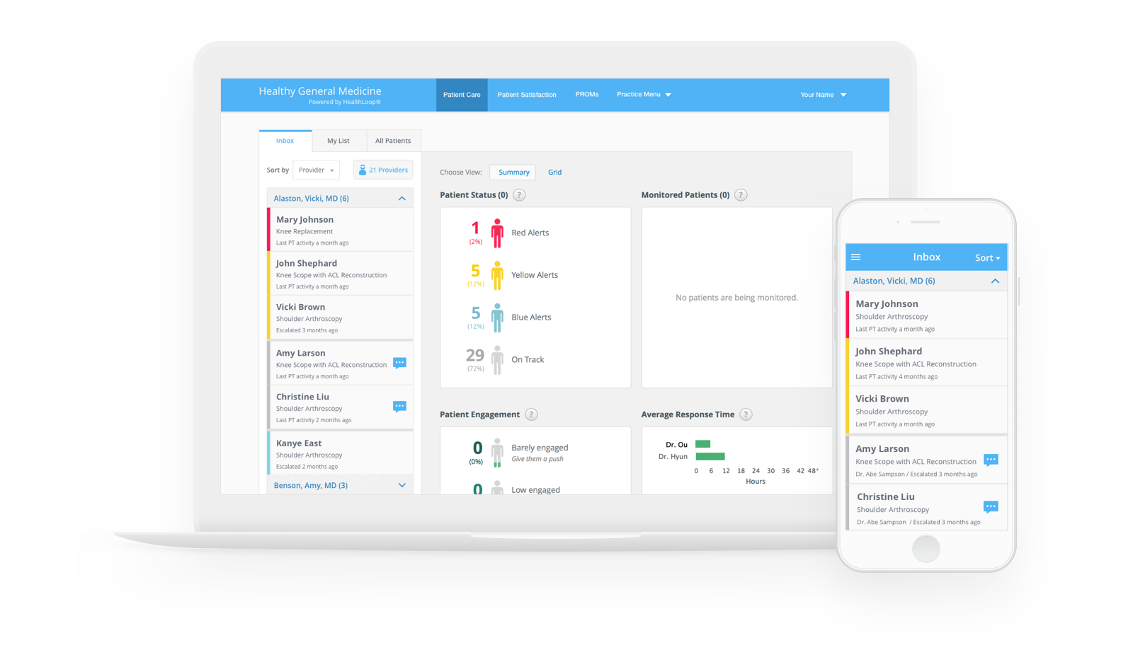
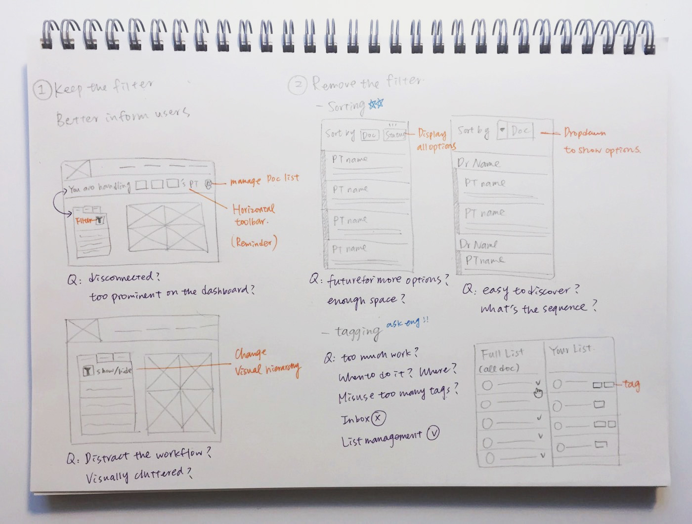
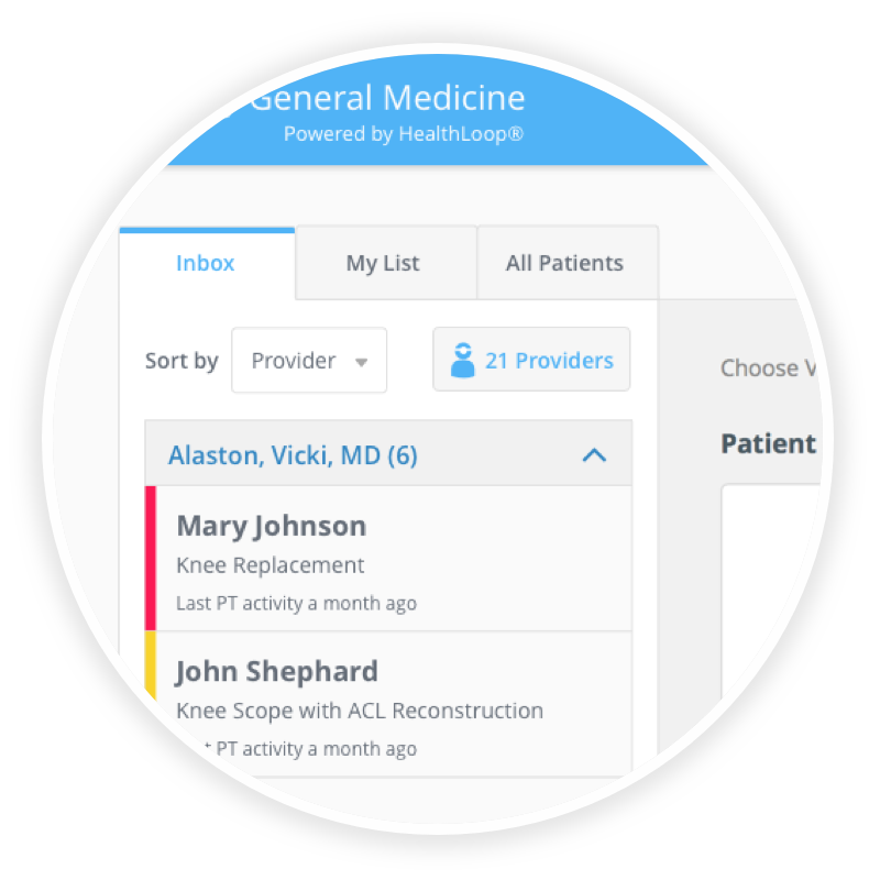
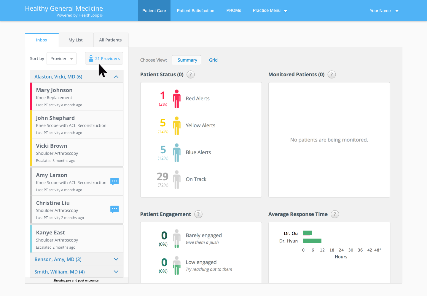
Grouping lists of tasks in the inbox by patient symptom severity does not meet the goal when staff want to deal with patients associated with a specific doctor.
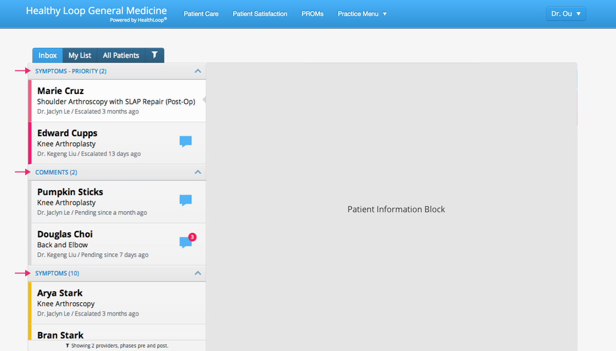
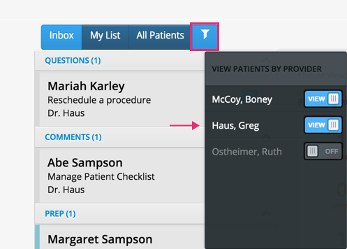
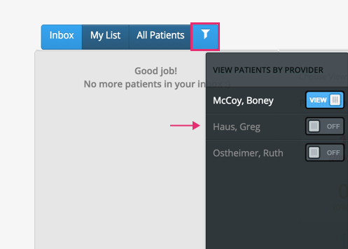
Staff apply the filter to view patients by doctor. However, they forget they’ve filtered the list and tend to ignore the filter status reminder. Therefore, no one takes care of certain patients because their information is hidden.
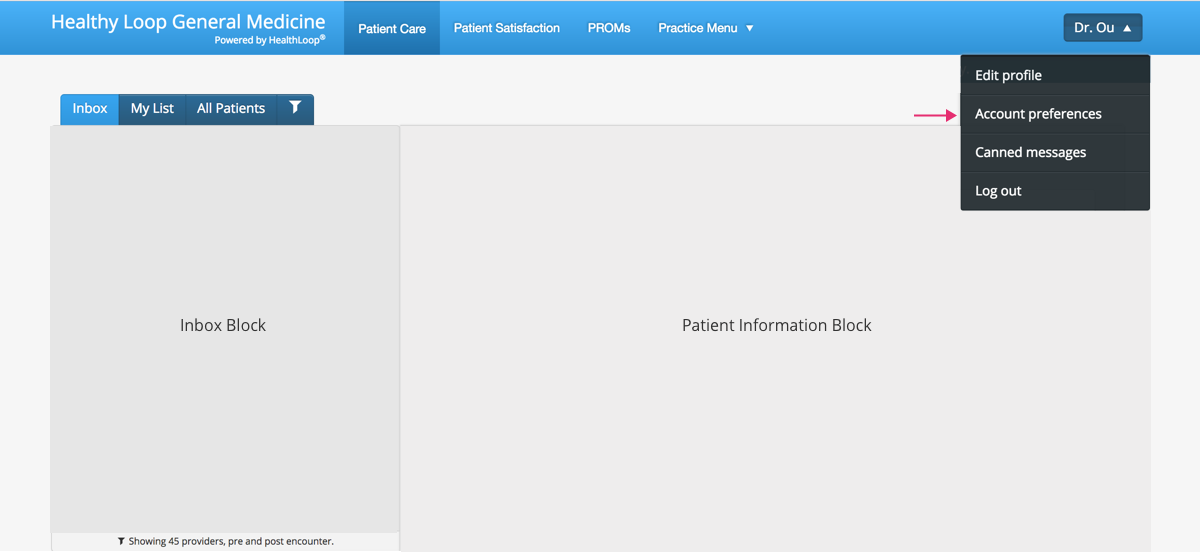
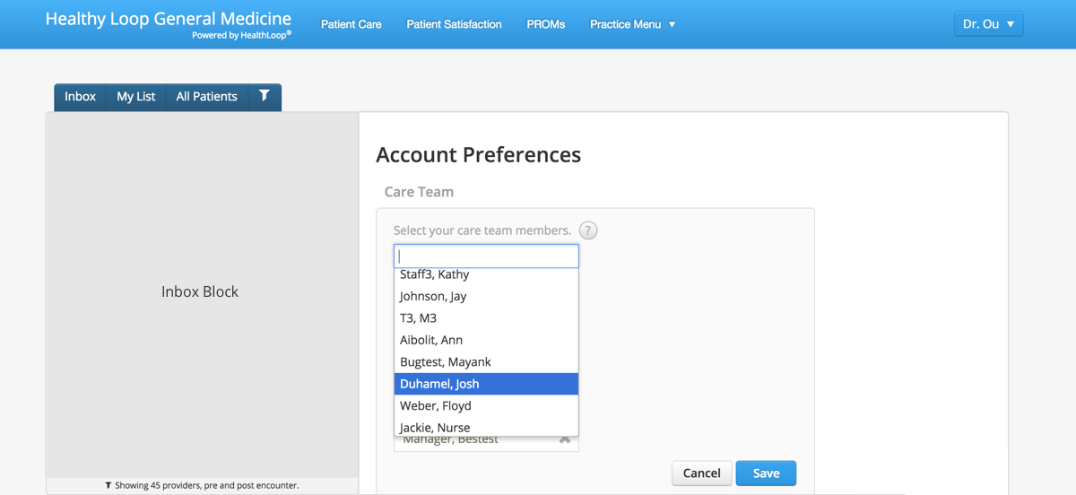
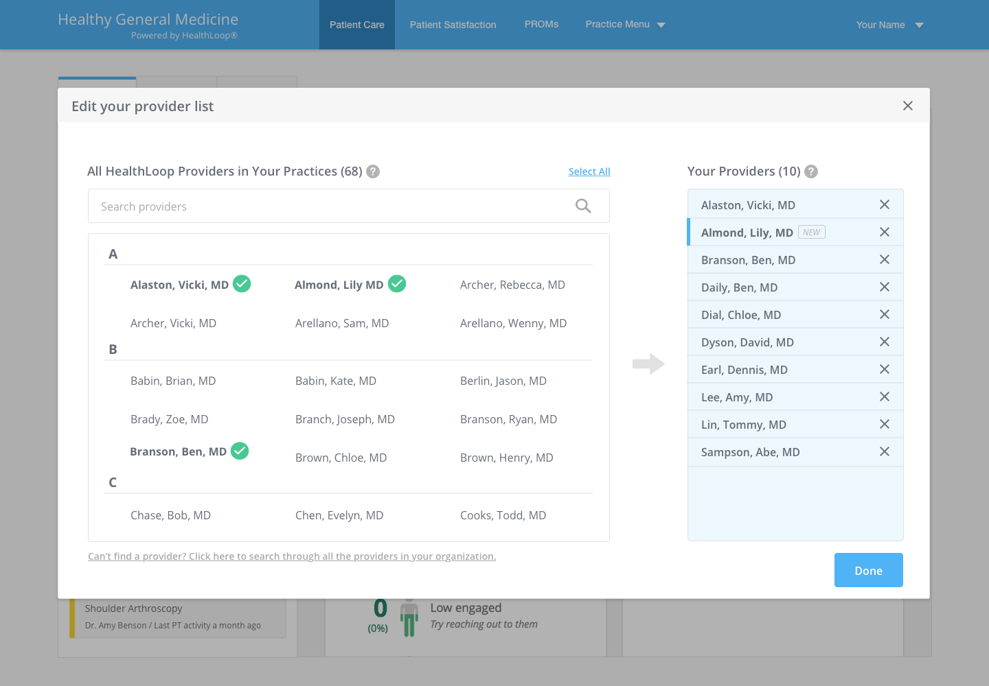
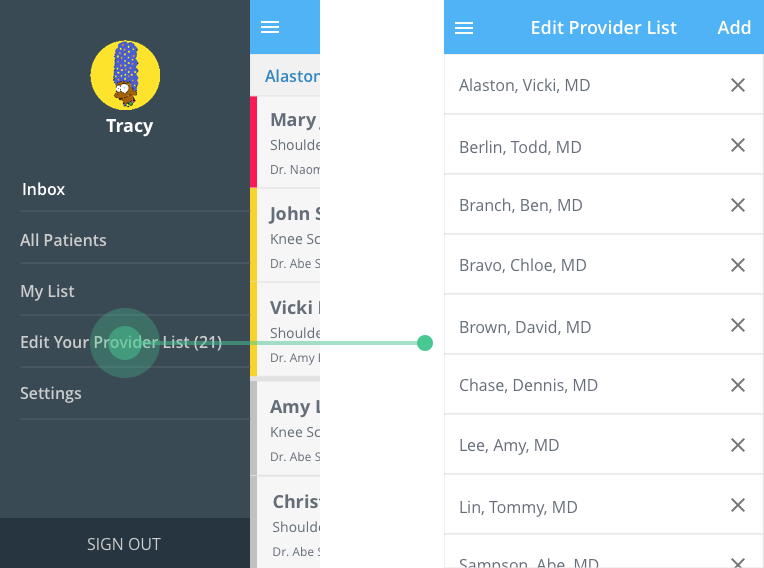
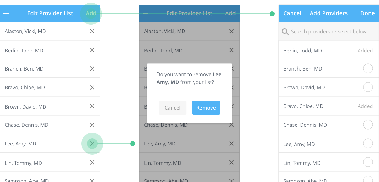
The configuration of handling the doctor list is not easy for staff to adjust the list because this feature is hidden in the navigation menu.
Doctor list is not scalable for health systems that have a more complex organization hierarchy. Staff users also need a better way to deal with large amounts of data.
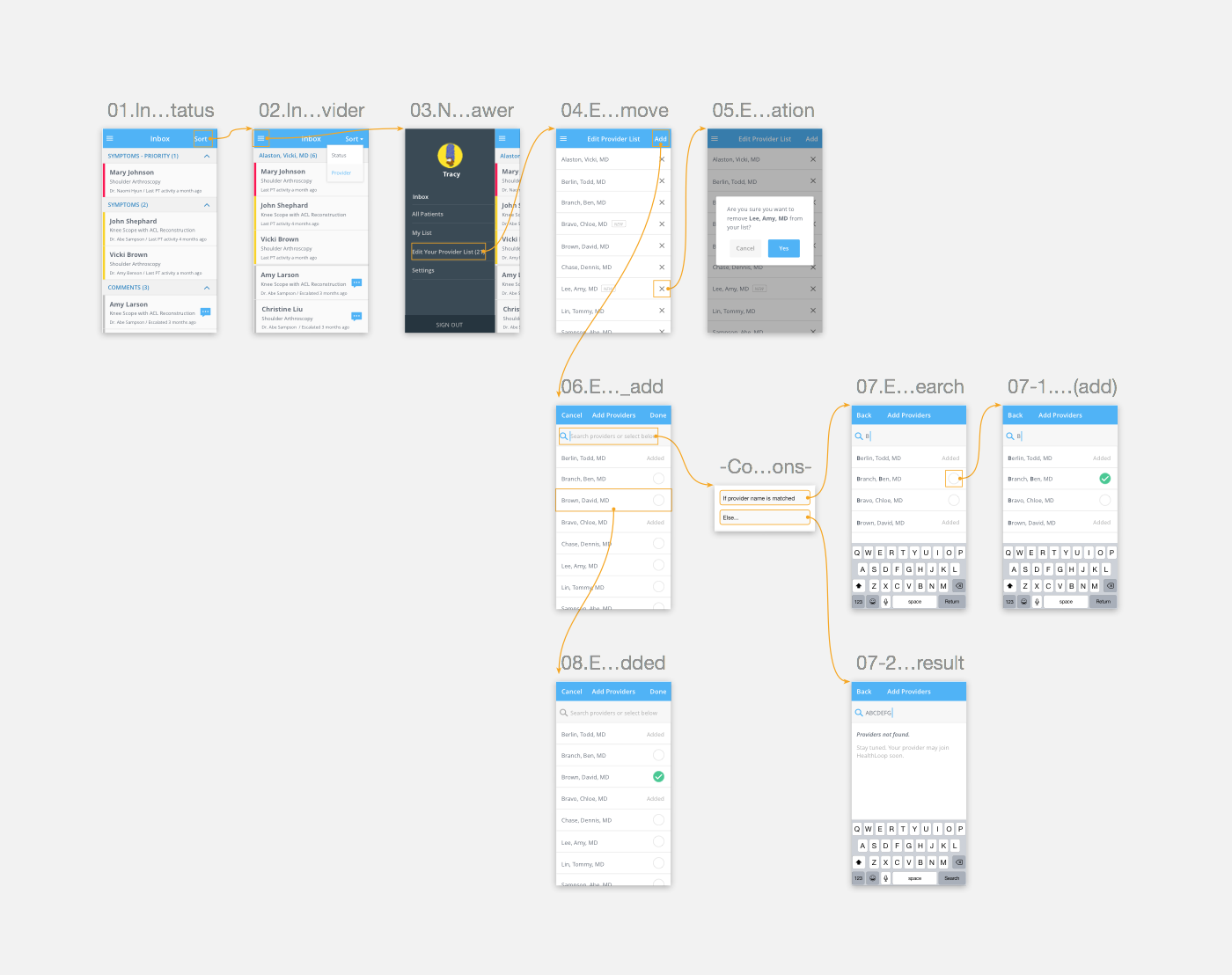
After having better understanding about the problems, I brainstormed the solutions and explored different layouts and interactions.
Considering the scenario that staff usually use desktops in the office, I chose the Desktop-First approach as the starting point and used the wireframe to present the concept to the team.
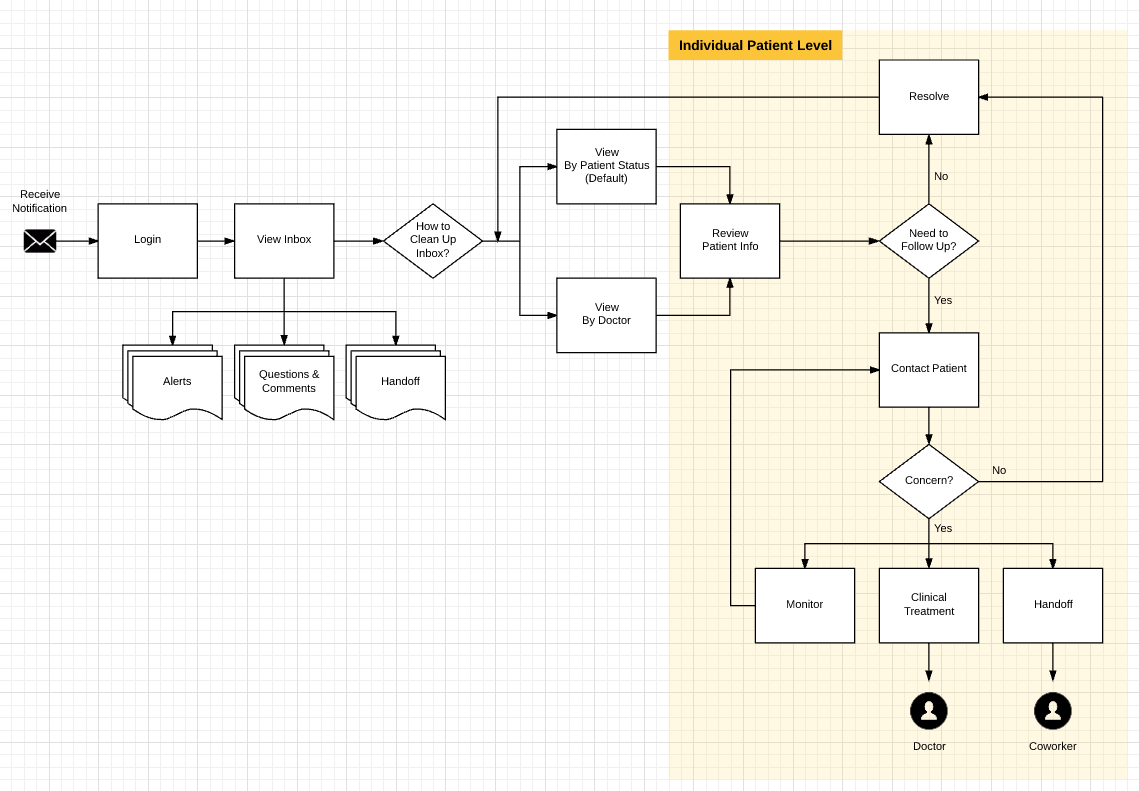
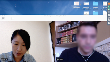
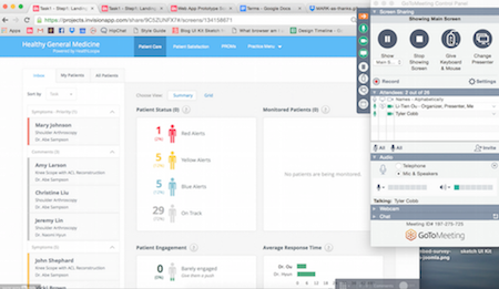
To deepen the knowledge of staff users' behavior and gather feedback about the changes, I established the research plan, defined tasks, recruited participants, and conducted remote user testing sessions with 6 staff users to validate the ideas.
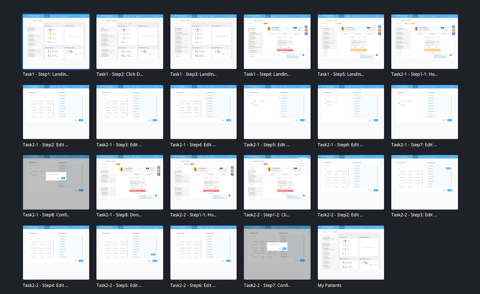
View the prototype here.
It’s helpful when doctors have different protocols or preferences.
I don’t need to go to the practice setting. It’s a good idea of having the two options of grouping things.
I know physicians I am looking at and covering with.
Incorporate the use case that staff users work for several doctors with different instructions or protocols. Therefore, users get jobs done faster without switching gears.
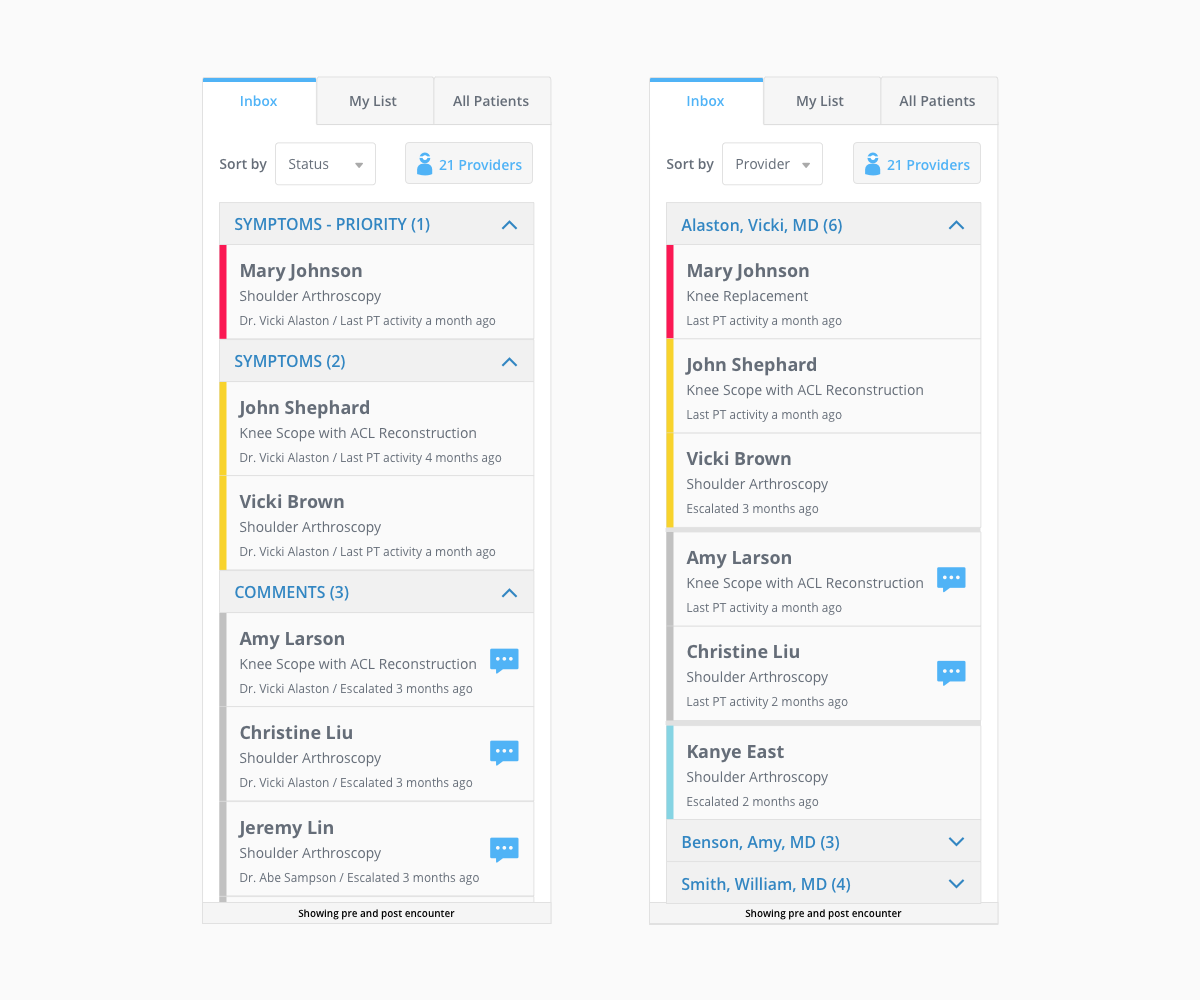
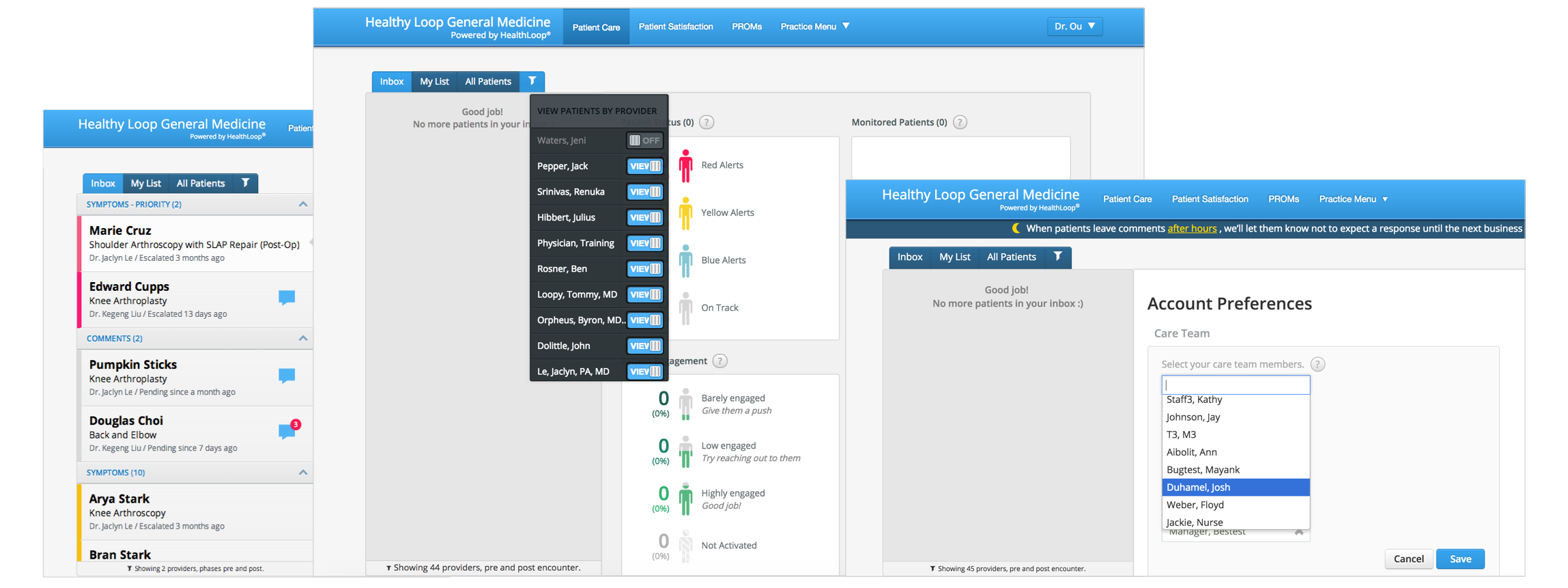
Get a clear sense of how many doctors on the list and have full control by seeing the completed to-do list coming from patients. No more hidden doctors and no more missing information.
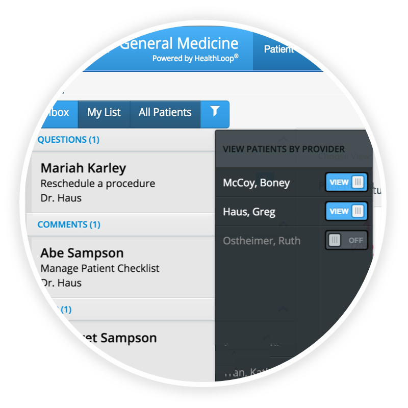
Provide a quick entry point to make the important configuration accessible and easy to find. Based on the user testing, 100% of the users clicked on the new quick entry point in the inbox to access the doctor list, and no one tried to look around the navigation menu.
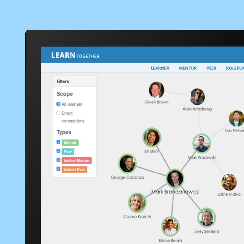
Improve browsing and provide a scoped search so that staff in a large health system can switch between department and organization level.
After validating the solution with users and polished the detailed design for the desktop version, I began to work on mobile design and adjusted the features based on the usage frequency and information architecture.
In the navigation drawer, the entry point of “Editing you provider list” was promoted one layer up from the Settings so it gets better visibility.
This is designed to support users who are anxious about making mistakes in the clinical handover (transition) process.
Through talking to the users, I learned to consider the political environment and how it affects staff users’ workflow and the willingness of using certain features.
With the new feature of sorting by doctors (physician centered), it could mean that doctor gets priority. Therefore, some clinical staff would never use it even if they believe the feature can help them to increase work efficiency. This also reveals the political environment in the healthcare organization and should be considered in the future design.
Consider the political environment in the organization ─ Like it ≠ Use it